Typografie im Responsive Webdesign
MobileTech Conference, Berlin 04.09.2013
Sven Wolfermann | maddesigns
MobileTech Conference, Berlin 04.09.2013
Sven Wolfermann | maddesigns

Twitter: @maddesigns
Web: http://maddesigns.de

The responsive web will be 99.9% typography

Wichtigste Fakten
Anything from 45 to 75 characters is widely regarded as a satisfactory length of line for a single-column page set in a serifed text face in a text size […] (counting both letters and spaces) […].
Trent Walton nutzt einen einfachen Trick mit * Sternchen
Lorem ipsum dolor sit amet, consectetur adip*isicing elit, sed do eiusmod *tempor incididunt ut labore et dolore magna aliqua.
„Wenn die zwei Sternchen in einer Textzeile sind, ist es Zeit die Schriftgröße zu erhöhen.“
Wenn man „Desktop first" entwickelt, dann Schriftgrößen, anpassen


The reference pixel is the visual angle of one pixel on a device with a pixel density of 96dpi and a distance from the reader of an arm's length.
For a nominal arm's length of 28 inches, the visual angle is therefore about 0.0213 degrees. For reading at arm's length, 1px thus corresponds to about 0.26 mm (1/96 inch).


Schriftgrößen-Empfehlung von Marko Dugonjić


font-size and line-height based on element width

CSS Anweisungen bisher
body {
  font-size: 100%; /* default = 16px */
}
body {
  font-size: 62.5%; /* calculate from 10px */
}

h1 {
  font-size: 2.4em; /* 24px */
}

p {
  font-size: 1.4em; /* 14px */
}
<h1>Überschrift
  <span>die noch eine Subline hat</span>
</h1>
body {
  font-size: 100%; } /* 16px */
h1 {
  font-size: 1.5em;  /* 24px / 16px */
  line-height: 1; }
span {
  font-size: 1em;    /* 16px / 16px */
  display: block; }
Bei der Berechnung von em-basierenden Schriften acht geben. Der em-Wert von font-size bezieht sich auf das Elternelement, em-Wert von margin/padding auf die eigene font-size
span {
  font-size: 0.666666667em; /* 16px / 24px */
}
In fast allen Browsern ist 16px die Default-Schriftgröße, allerdings haben einige Mobile-Browser höhere Schriftgrößen. Blackberry OS 6.0 = 22px, Kindle Touch = 26px, UC-Browser = 19px.
body { font-size: 1em; }
@media only screen and (min-width: 600px) {
  body { font-size: 1.5em; }
}
@media only screen and (min-width: 750px) {
  body { font-size: 2em; }
}
@media only screen and (min-width: 1000px) {
  body { font-size: 2.5em; }
}
rem Schriftgrößen basierend auf dem Rootelement (<html>)
span {
  font-size: 1rem; /* 16px / 16px */
}
Achtung! rem basiert auf <html>
=> default meist 100% => 16px!
html { font-size: 16px; }
body { font-size: 62.5%; }
Media-Querys in em – Basisberechnung ist 16px, nicht was für html {} definiert ist
Chrome seit Version 6.0 (aktuell Version 29)
Firefox seit Version 3.6 (aktuell Version 23)
Opera / Mobile seit 11.6 / 12.0 (16 / 14)
Safari / iOS seit Version 5.0 / 4.0 (6.0 / 6.1)
Android seit Version 2.1 (4.3)
IE / mobile seit Version 9.0 / 9.0 (10.0 / 10.0)
$main-font-size: 16px;

@mixin x-rem ($property, $value) {
  #{$property}: $value * $main-font-size;
  #{$property}: #{$value}rem;
}

// usage
.some-class {
  @include x-rem(font-size, 1.4);
}
https://gist.github.com/maddesigns/6415889
Vorteil: einfache Basis für fonts-size, umfangreiche Einsatzmöglichkeiten
Sass:
.some-class {
  @include x-rem(14px);
  //@include x-rem(14px, font-size);
  @include x-rem(0 12px 2 1.2, margin);
  @include x-rem(1.5 24px, padding);
}
CSS:
.some-class {
  font-size: 0.875rem;
  margin: 0 0.75rem 2rem 1.2rem;
  padding: 1.5rem 1.5rem;
}
Größen relativ zum Viewport
1vw = 1% of viewport width
1vh = 1% of viewport height
1vmin = 1vw or 1vh, whichever is smaller
1vmax = 1vw or 1vh, whichever is larger
h1 {
  font-size: 5.9vw;
}
h2 {
  font-size: 3.0vh;
}
p {
  font-size: 2vmin;
}
Chrome seit Version 26.0 (aktuell Version 29)
Firefox seit Version 19 (aktuell Version 23)
Opera / Mobile seit 15 / 14 (16 / 14)
Safari / iOS seit Version 6.0 / 6.0 (6.0 / 6.1)
Android kein Support :(
IE / mobile seit Version 9.0 / 9.0 (10.0 / 10.0)
je länger die Zeile, desto mehr Abstand zur nächsten Zeile

wenn Text umbricht, muss man noch die Zugehörigkeit erkennen

Flexibler Zeilendurchschuss

$('.intro').moltenLeading({
  minline: 1.2,
  maxline: 1.4,
  minwidth: 320,
  maxwidth: 750
});
/* prevent auto text-size adjusting */
html {
  -webkit-text-size-adjust: 100%;
  -ms-text-size-adjust: 100%;
}
letter-spacing im Web ist oft zu eng
p {
  letter-spacing: 0.01em;
  word-spacing: 0.01em;
}
Vorteil: Kerning aktivieren
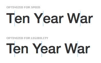
h1 {
text-rendering: optimizeLegibility;
}
Firefox: wenn die font-size größer als 20px ist, dann nutzt Firefox automatisch optimizeLegibility; für kleineren Text nutzt Firefox optimizeSpeed
Web-Fonts werden in allen Browsern bis zurück zum IE6 unterstützt
Das klingt doch gut!
@font-face {
 font-family: 'DINBold';
 src: url("din-bold-webfont.eot");
 src: url("din-bold-webfont.eot?#iefix") format("embedded-opentype"),
      url("din-bold-webfont.woff") format("woff"),
      url("din-bold-webfont.ttf") format("truetype"),
      url("din-bold-webfont.svg#DINBold") format("svg");
}

WOFF Font-Einbindung für moderne Browser (für Android zusätzlich TTF einbinden)
@font-face {
  font-family: Fontname; /* regular font */
  src: url("/fonts/Fontname-Regular.woff") format("woff");
  font-weight: normal;
  font-style:  normal; }

@font-face {
  font-family: Fontname; /* bold font */
  src: url("/fonts/Fontname-Bold.woff") format("woff");
  font-weight: bold;
  font-style:  normal; }

@font-face {
  font-family: Fontname; /* italic font */
  src: url("/fonts/Fontname-Italic.woff") format("woff");
  font-weight: normal;
  font-style:  italic; }

@font-face {
  font-family: Fontname; /* bolditalic font */
  src: url("/fonts/Fontname-BoldItalic.woff") format("woff");
  font-weight: bold;
  font-style:  italic; }
/* ie-specific.css */
@font-face {
  font-family: Fontname-regular; /* regular IE font */
  src: url("/fonts/Fontname-Regular.eot"); }

@font-face { /* bold IE font */
  font-family: Fontname-bold;
  src: url("/fonts/Fontname-Bold.eot"); }

@font-face { /* italic IE font */
  font-family: Fontname-italic;
  src: url("/fonts/Fontname-Italic.eot"); }

@font-face { /* bold italic IE font */
  font-family: Fontname-bolditalic;
  src: url("/fonts/Fontname-BoldItalic.eot"); }
Conditional Comments
<!--[if lt IE 9]>
  <link rel="stylesheet" href="ie-specific.css" type="text/css" media="screen" />
<![endif]-->
„interpoliertes Fetten“ oder „doppelt gefettet“


/* ie-specific.css */
strong, b {
  font-family: Fontname-bold;
  font-weight: normal;
}
em, i {
  font-family: Fontname-italic;
  font-style: normal;
}
strong em, em strong,
strong i, i strong,
b em, em b,
b i, i b {
  font-family: Fontname-bolditalic;
  font-style: normal;
  font-weight: normal;
}
Font auswählen und Seite an Seite mit anderen vergleichen


 Text mit Webfonts werden in mobilen Browsern nicht angezeigt, bis die Schrift geladen ist um den „FOUT“ (Flash of unstyled content) zu vermeiden.


Webfonts nur für große Bildschirme (impliziert schnellere Verbindung)
@font-face {
  font-family: "Fontname";
  src: url("/fonts/Fontname-Regular.woff") format("woff");
  font-weight: normal;
  font-style: normal;
}
@media only screen and (min-width: 768px) {
  body {
    font-family: "Fontname", Georgia, serif;
  }
}
in modernen Browsern werden Schriften erst geladen, wenn sie zugewiesen werden
m.guardian.co.uk lädt Webfonts nur für moderne Devices (Browser)
=> safe fonts to LocalStorage
=> load fonts
für Typekit, Google, Fontdeck, Fonts.com, … und selbstgehostete Fonts
<script>
WebFontConfig = {
  typekit: { id: 'xxxxxx' }
};
(function() {
  var wf = document.createElement('script');
  wf.src = ('https:' == document.location.protocol ? 'https' : 'http') +
    '://ajax.googleapis.com/ajax/libs/webfont/1.4.7/webfont.js';
  wf.type = 'text/javascript';
  wf.async = 'true';
  var s = document.getElementsByTagName('script')[0];
  s.parentNode.insertBefore(wf, s);
})();
</script>
CSS Klassen für Font-Events
.wf-loading
.wf-active
.wf-inactive
.wf-<familyname>-<fvd>-loading
.wf-<familyname>-<fvd>-active
.wf-<familyname>-<fvd>-inactive
h1, h2, h3 {
  font-family: sans-serif;
}

.wf-active h1, .wf-active h2, .wf-active h3 {
  font-family: "webfont", sans-serif;
}


Font-Stack-Beispiel für den 'serif' Font-Fallback
font-family: 'Minion','Droid serif','Times New Roman',Times,serif;


Helvetica nur auf iOS, Arial auf iOS, WP und BB
auf Android nur Droid Sans, Droid Serif, Droid Sans Mono und Roboto
Helvetica-Fallback Beispiel

Firefox für Android seit Version 21 mit neuen System-Fonts


Textlängen beschneiden
.class {
  overflow: hidden;
  text-overflow: ellipsis;
  white-space: nowrap;
}
Demo: Lorem ipsum dolor sit amet, consectetur adipisicing elit. Ab eaque dignissimos eveniet aliquid perferendis pariatur dolorum fugit earum nisi id repellendus tenetur odit alias laudantium minima deleniti beatae sed rem.
"Problem": geht nur bei einzeiligen Texten
(white-space: nowrap)
Vorsichtig mit text-overflow

h3 {
font-size: 16px;
line-height: 1.4;
max-height: 46px;
overflow: hidden;
width: 180px;
}
.shy {
/* use the HTML-entity
Kriegsgräberfürsorge */
}
.hyphens {
-webkit-hyphens: auto;
   -moz-hyphens: auto;
        hyphens: auto;
}
.word-break {
/* Non standard for webkit */
word-break: break-word;
-ms-word-break: break-all;
word-break: break-all;
}

wenn Text zentriert wird, hyphenation aktivieren
-webkit-hyphens: auto;
-moz-hyphens: auto;
hyphens: auto;
}
hyphenate-limit-lines: 2; /* support in IE10 */
hyphenate-limit-chars: 6 3 2; /* longer than 6 characters, 3 or more
                                 before break, 2 or more after break */
Chrome 29 und Android 4.0 Browser unterstützen "-webkit-hyphens: none", aber nicht die "auto" Eigenschaft.
OpenType Features mit CSS3 nutzen


| OpenType tag | Enables |
|---|---|
kern
|
Kerning |
liga
|
Standard ligatures |
dlig
|
Discretionary ligatures |
smcp
|
Small capitals |
subs
|
Subscript |
sups
|
Superscript |
swsh
|
Swashes |
ss01,
ss02,
…, ss20
|
Stylistic sets 1 to 20 |
Small Caps aktivieren (10% vergrößerte Kapitälchen)
p.smallcaps { font-feature-settings: "smcp" 1; }
Ligaturen aktivieren
p.ligatures{ font-feature-settings: "liga" on; }
mehrere Zuweisungen
.element {
    -webkit-font-feature-settings: "kern", "liga", "case";
       -moz-font-feature-settings: "kern", "liga", "case";
            font-feature-settings: "kern", "liga", "case";
}

// $Variable $BaseType
$serif-boolean: true !default;
$font-family: if($serif-boolean, serif, sans-serif) !default; // Non-font-face font-stack
$font-weight: normal !default;
$line-height: 1.65 !default;
$font-size: 112.5 !default; // percentage value (16 * 112.5% = 18px)
$font-base: 16 * ($font-size/100) !default; // converts our percentage to a pixel value
$custom-font-family: false !default; // Custom font-face stack, if set will be added to the $font-family
…
Überschriften an Bildschirm anpassen

<script src="jquery.fittext.js"></script>
<script>
  jQuery(".responsive_headline").fitText();
</script>
A jQuery plugin for producing big, bold & responsive headlines

A jQuery plugin to set font sizes responsively

Sven Wolfermann | maddesigns