Latest Tricks in RWD
Sven Wolfermann | @maddesigns
Sven Wolfermann | @maddesigns


Responsive Product Grid


http://codepen.io/maddesigns/full/yJdiL/
http://codepen.io/maddesigns/full/EBlHd/
.grid {
  max-width: 1280px;
  display: flex;
  flex-wrap: wrap;
}

.column {
  flex: 1 0 250px;
}


Beware of a11y problems,
keep logical content order!
…
@media only all and (min-width: 64em) {
  .recipe__tags {
    order: 6;
    width: 25%;
  }
}

@media only all and (min-width: 64em) {
  .recipe__image {
    order: 7;
    width: 75%;
  }
}


flexible button bar without media queries
same height centered button (link) text

scrollable tbody, pure CSS solution

http://codepen.io/maddesigns/pen/JEdjKj
HT: https://martinwolf.org/blog/2017/01/responsive-tabellen-nur-mit-css
display: table

http://maddesigns.de/flexbox-fallbacks-2670.html
https://kyusuf.com/post/almost-complete-guide-to-flexbox-without-flexbox
The new W3C standard for grid layouts
https://www.w3.org/TR/css-grid-1/ (Candidate Recommendation)


http://gridbyexample.com/examples/ by Rachel Andrew
<div class="wrapper">
    <div class="box a">.a</div>
    <div class="box b">.b</div>
    <div class="box c">.c</div>
    <div class="box d">.d</div>
</div>
new display property: display: grid;
.wrapper {
    display: grid;
    grid-template-columns: 33.334% 33.334% 33.334%; /* 3 columns */
}
a {
    grid-column: 1 / span 2;  /* starts at col pos 1, span 2 cols */
    grid-row:    1 / span 1;  /* starts at row pos 1, span 1 row */
}
.a {
    grid-column: 1 / span 2;
    grid-row: 1 / span 1;
}
.b {
    grid-column: 3 / span 1;
    grid-row: 1 / span 2;
}
Like flexbox grid cells are same height by default

“Table Layouts?”
🤔
 * with Sass 😉
We don’t need a grid layout based framework.
It is a grid framework.
— @rachelandrew
@media (min-width: 35em) { /* <= see, grid only for bigger screens */
    .wrapper {
        display: grid;
        grid-gap: 1rem;
        grid-template-columns: 61.8% 38.2%; /* golden ratio */
        grid-template-areas:
            "header   header"
            "content sidebar"
            "footer   footer";
            /*61.8%   38.2%*/
    }
}

@media (min-width: 35em) {
    .grid {
        display: grid;
        grid-template-columns: 10% 15% 20% 25% 30%;
    }
}
 Data on support for the css-grid feature across the major browsers from caniuse.com.
text flows into columns

set column-count for each breakpoint
@media (min-width: 40em) {
    p {
        columns: 2;
    }
}
@media (min-width: 60em) {
    p {
        columns: 3;
    }
}
@media (min-width: 80em) {
    p {
        columns: 4;
    }
}p {
columns: 3 20em; /* max 3 columns, min 20em */
}
min-height Media Queryuse column text only for larger screens to avoid scrolling up and down
@media (min-height: 35em) {
  p {
    columns: 3 20em;
  }
}
img {
  min-width: 50%;                    /* value to use above 400px */
  width: calc((400px - 100%) * 400); /* 400px "breakpoint" */
  max-width: 100%;                   /* value to use below 400px */
}

h1 {
  font-size: calc(4vw + 4vh + 2vmin);
}font-size: min 16px, max 24px between 400-800px viewport
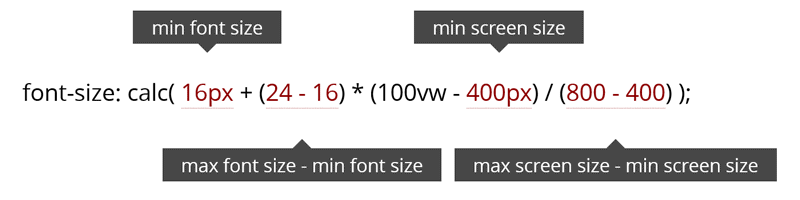
h1 { font-size: 16px; }

@media screen and (min-width: 400px) and (max-width: 800px) {
  h1 { font-size: calc(16px + (24 - 16) * (100vw - 400px) / (800 - 400)); }
}

@media screen and (min-width: 800px) {
  h1 { font-size: 24px; }
}
<article>
  <p>…</p>
  <div class="full-width">
    <img src="image.jpg">
  </div>
  <p>…</p>
</article>article {
max-width: 80em;
margin: 0 auto;
}
.full-width {
margin: 0 calc(-50vw + 50%);
}without calc()
.full-width {
  position: relative;
  left: 50%;
  right: 50%;
  margin-left: -50vw;
  margin-right: -50vw;
}

A compressed copy of the Doom (1993) installer was 2.34 Mb


<img
  srcset=" large.jpg 1200w,
           medium.jpg 600w,
           small.jpg 360w"
  sizes="  (min-width: 50em) 33vw,
           (min-width: 28em) 50vw,
           100vw"
  src="small.jpg"
  alt="alttext"
/>


picture/srcset has native support in all major browser

use respimage or picturefill for cross browser-support

It’s easy to make a bunch of boxes responsive
Sven Wolfermann | @maddesigns | maddesigns.de
