Sass
Workshop ]init[
Referent: Sven Wolfermann | maddesigns
Workshop ]init[
Referent: Sven Wolfermann | maddesigns

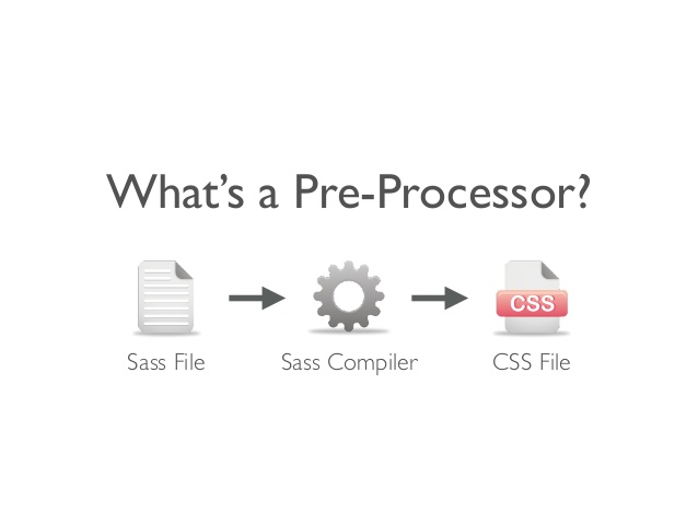
A preprocessor is a program that takes one type of data and converts it to another type of data.
CSS on its own can be fun, but stylesheets are getting larger, more complex, and harder to maintain. This is where a preprocessor can help.
Building a function, reusing a definition or inheritance are hard to achieve. For bigger projects, or complex systems, maintenance is a very big problem.
Sass has two syntaxes.
The new main syntax is known as “SCSS” (for “Sassy CSS”).
SCSS files use the extension .scss.
The second, older syntax is known as the indented syntax (or just “Sass”).
Instead of brackets and semicolons,
it uses the indentation of lines to specify blocks.
Files in the indented syntax use the extension .sass.
section {
  margin: 1em 0;

  header {
    background-color: lightpink;
  }
}
section
  margin: 1em 0

  header
    background-color: lightpink
many GUIs for compiling
and build in in many text editors or IDEs
compiling single file SCSS to CSS
$ sass input.scss output.css
watch folder changes
$ sass --watch sass:css
watch file changes
$ sass --watch sass/style.scss:css/style.css
// sass --watch sass:css --style compressed
html,body{height:100%}.container{min-height:100%;max-width:1200px;width:auto;margin:0 auto;padding:0 20px}.container h1{border-bottom:2px solid #000;color:#ff8700;margin:0 0 0.5em}
// sass --watch sass:css --style compact
html, body { height: 100%; }

.container { min-height: 100%; max-width: 1200px; width: auto; margin: 0 auto; padding: 0 20px; }
.container h1 { border-bottom: 2px solid black; color: #ff8700; margin: 0 0 0.5em; }
// sass --watch sass:css --style nested
html,
body {
  height: 100%; }

.container {
  min-height: 100%;
  max-width: 1200px;
  width: auto;
  margin: 0 auto;
  padding: 0 20px; }
  .container h1 {
    border-bottom: 2px solid black;
    color: #ff8700;
    margin: 0 0 0.5em; }
// sass --watch sass:css --style expanded
html,
body {
  height: 100%;
}

.container {
  min-height: 100%;
  max-width: 1200px;
  width: auto;
  margin: 0 auto;
  padding: 0 20px;
}
.container h1 {
  border-bottom: 2px solid black;
  color: #ff8700;
  margin: 0 0 0.5em;
}
h1 {
  border-bottom: 2px solid #000000; // black
  color: #FF8700; // orange
  margin: 0 0 0.5em;
}
change to global variables
$brand-color1: #000000;
$brand-color2: #FF8700;

h1 {
  border-bottom: 2px solid $brand-color1;
  color: $brand-color2;
  margin: 0 0 0.5em;
}
variables can be colors, sizes, percentage, ...
$page_max_width: 1200px;
$padding: 20px;
.container {
  min-height: 100%;
  max-width: $page_max_width;
  width: auto;
  margin: 0 auto;
  padding: 0 $padding;
}
$message-color: blue !default;
But you can then optionally override the module defaults before its inclusion:
$message-color: black;
@import 'my-module';
/* compiled CSS */
p.message {
  color: black;
}
Variables can be expanded in selectors, too:
$alertClass: "error";

p.message-#{$alertClass} {
    color: red;
}
/* compiled CSS */
p.message-error {
  color: red;
}
SCSS
.container {
  max-width: $page_max_width - $padding * 2;
  padding: 0 $padding;
  ...
}
CSS
.container {
  max-width: 1160px; /* 1200px - 20px * 2 */
  padding: 0 20px;
  ...
}
writing long selectors is time consuming
short selectors are better in general
CSS
nav {float: right;}
nav li {float: left;}
nav li a {color: #666;}
nav li a:hover {color: #333;}
nav li.current {font-weight: bold;}
SCSS
nav {
  float: right;

  li {
    float: left;

    a {
      color: #666;

      &:hover {
        color: #333;
      }
    }

    &.current {
      font-weight: bold;
    }
  }
}
identation with SCSS makes no difference in CSS output
SCSS
nav {float: right;
li {float: left;
a {color: #666;
&:hover {
color: #333;}
}
&.current {
font-weight: bold;}
}}
but sure it looks better if intended
Sass nesting != HTML nesting
be careful with nesting!
you can run into performance issues with long selectors
div {
  color: black
  .foo {
    color: black } // descendant
  + .foo {
    color: black } // adjacent
                   // sibling
  > .foo {
    color: black } // child
  ~ .foo {
    color: black } // general
                   // sibling
  & .foo {
    color: black } // Sass' parent
                   // selector
  &.bar {
    color: black }
  &:hover {
    color: black }
}
div {
  color: black; }
div .foo {
  color: black; }
div + .foo {
  color: black; }

div > .foo {
  color: black; }
div ~ .foo {
  color: black; }

div .foo {
  color: black; }

div.bar {
  color: black; }
div:hover {
  color: black; }
the & (ampersand) has a placeholder function for the parental selector
a {
  &:hover,
  &:focus {
    color: black
  }
}
a:hover, a:focus {
  color: black;
}
Usecase for Modernizr classes
div {
  box-shadow: 0 0 5px rgba(#000, 0.8); // Sass feature: Hex2RGB colors

  .no-boxshadow & {
    border: 1px solid #555;
  }
}
div {
  box-shadow: 0 0 5px rgba(0,0,0, 0.8);
}

.no-boxshadow div {
  border: 1px solid #555;
}
div {
  .parent & .child {
    color: black
  }
}
.parent div .child {
  color: black;
}
/* Hey look at this multiline comment
* that we want to show up in our CSS output. */
.container {
  color: black; }

// These comments are single lines and
// we do not want them to appear in our CSS
footer {
  color: #336699; }
This compiles to:
/* Hey look at this multiline comment
* that we want to show up in our CSS output. */
.container {
  color: black; }
footer {
  color: #336699; }
the way in CSS
/* style.css */
@import "base.css";
@import url("styles.css");
@import url("druck.css") print;
Importing CSS files into one file can cause performance issues
Limit your external references in your HTML
split your stylesheet in many chunks and use the import function of Sass
@import "modules/base";
@import "partials/header", "partials/footer";
create subfolders and devide into partials
use underscore in your filenames to concatinate the partials within the compiling process
Imagine this structure
/style.sass
/modules/
┗ _normalize.sass
┗ _base.sass
┗ _mixins.sass
/partials/
┗ _footer.sass
┗ _header.sass
/ie.sass
/print.sass
none underscore files will be compiled into seperate CSS files
# style.sass
@import modules/normalize
@import modules/base
@import modules/mixins
@import partials/header
@import partials/footer
@import ie
@import print
this compiles to 3 files:
/css
┗ style.css
┗ ie.css
┗ print.css
@extend clones the attributes from rules and adds them to another rule.
.button {
  background-color: $color-main;
  font-weight: bold;
  color: white;
  padding: 5px;
}
Then we can @extend the class to another
.button-checkout {
  @extend .button;
  background-color: darken($color-main, 20%);
}
.button-checkout {
  @extend .button;
  background-color: darken($color-main, 20%);
  .msg & {
    @extend .button;
    background-color: darken($color-main, 30%);
  }
}
.button, .button-checkout, .msg .button-checkout {
  background-color: blue;
  font-weight: bold;
  color: white;
  padding: 5px; }

.button-checkout {
  background-color: #000099; }
.msg .button-checkout {
  background-color: #000066; }
// This ruleset won't be rendered on its own.
%button {
  color: blue;
  font-weight: bold;
  font-size: 2em; }
placeholder selectors can be extended, just like classes and IDs. The extended selectors will be generated, but the base placeholder selector will not
.btn-notice { @extend %button; }
.btn-notice {
  color: blue;
  font-weight: bold;
  font-size: 2em; }
placeholder selectors will not be rendered to CSS.
%button {
  background-color: $color-main;
  font-weight: bold;
  color: white;
}

.button-checkout {
  @extend %button;
  background-color: darken($color-main, 20%);
}
.button-checkout {
  background-color: blue;
  font-weight: bold;
  color: white; }
.button-checkout {
  background-color: #000099; }
.button-cancel {
  @extend %button;
  background-color: $darkgrey;
}
.button-submit {
  @extend %button;
  background-color: $color-highlight;
  color: $darkest;
}
.button-checkout, .button-cancel, .button-submit {
  background-color: blue;
  font-weight: bold;
  color: white; }
.button-checkout { background-color: #000099; }
.button-cancel   { background-color: #333333; }
.button-submit   { background-color: #FF9900; color: #222; }
Are code snippets (reusable elements)
Parameterizable (use reasonable defaults)
@mixin border-radius($value) {
  -webkit-border-radius: $value;
  -moz-border-radius: $value;
  border-radius: $value;
}
.box {
  color: $color-main;
  font-family: $helvetica-font-stack;
  @include border-radius(5px);
}
compiled to
.box {
  color: blue;
  font-family: "Helvetica Neue", Arial, Helvetica, sans-serif;
  -webkit-border-radius: 5px;
  -moz-border-radius: 5px;
  border-radius: 5px;
}
but thats a bad example – no need for the vendor prefixes of border-radius anymore
only use border-radius: 5px; in your stylesheets
Defaults and named arguments
@mixin link-colors($text:blue, $hover:red) {
  color: $text;
  &:hover { color: $hover; }
}

a {
  @include link-colors($hover: green);
}
a { color: blue; }
a:hover { color: green; }
Variable arguments for functions/mixins
@mixin box-shadow($shadows...) {
  -moz-box-shadow: $shadows;
  -webkit-box-shadow: $shadows;
  box-shadow: $shadows;
}

.shadows {
  @include box-shadow(0px 4px 5px #666, 2px 6px 10px #999);
}
.shadows {
  -moz-box-shadow: 0px 4px 5px #666, 2px 6px 10px #999;
  -webkit-box-shadow: 0px 4px 5px #666, 2px 6px 10px #999;
  box-shadow: 0px 4px 5px #666, 2px 6px 10px #999;
}
still… no need for box-shadow vendor prefix
@mixin forIE8 {
  .lt-ie9 & {
    @content;
  }
}

.m-login {
  box-shadow: 0px 4px 5px $grey;
  @include forIE8 {
    border: 1px solid $grey;
  }
}
.m-login {
  box-shadow: 0px 4px 5px #666
}
.lt-ie9 .m-login {
  border: 1px solid #666;
}
Relational operators (<, >, <=, >=) evaluate numbers
1 < 20 // true
10 <= 20 // true
4 > 1 // true
4 >= 1 // true
Comparison operators (==, !=) evaluate all data types
1 + 1 == 2 // true
small != big // true
#000 == black // true
@if
@for
@each
@while
$theme: ocean;
div {
  @if $theme == dusty {
    background: #c6bba9;
    color: $color;
  } @else if $theme == ocean {
    background: blue;
    color: white;
  }
}
@for $level from 0 to 5 {
  .tag-#{$level + 1} {
    font-size: .7em + ($level * .5em);
  }
}
.tag-1 { font-size: 0.7em; }
.tag-2 { font-size: 1.2em; }
.tag-3 { font-size: 1.7em; }
.tag-4 { font-size: 2.2em; }
.tag-5 { font-size: 2.7em; }
@each $section in home, about, archive, projects {
  nav {
    .#{$section} & {
      background-image: url(/images/nav/#{$section}.png);
    }
  }
}
.home nav {
  background-image: url(/images/nav/home.png); }
.about nav {
  background-image: url(/images/nav/about.png); }
.archive nav {
  background-image: url(/images/nav/archive.png); }
.projects nav {
  background-image: url(/images/nav/projects.png); }
@function grid-width($cells) {
  @return ($cell-width + $cell-padding) * $cells;
}
Function to calculate the em font size from pixels
@function px2em($font_size, $base_font_size: 16) {
  @return $font_size / $base_font_size + em
}
aside {
  width: 100%;
  @media screen and (min-width: 680px) {
    width: 25%;
  }
}
aside {
  width: 100%;
}
@media screen and (min-width: 680px) {
  aside {
    width: 25%;
  }
}
nav {
  ul {
    > li {
      font-size: 100%;
      color: black;
      padding: 10px;

      @media (min-width: 750px) {
          font-size: 150%;
      }
    }
  }
}
/* compiled CSS */
nav ul > li {
  font-size: 100%;
  color: black;
  padding: 10px;
}

@media (min-width: 750px) {
  nav ul > li {
    font-size: 150%;
  }
}
p {
  @media (min-width: 768px) {
    font-size: 150%;
    @media (orientation: landscape) {
      line-height: 1.2;
    }
  }
}
/* compiled CSS */
@media (min-width: 768px) {
  p {
    font-size: 150%;
  }
}
@media (min-width: 768px) and (orientation: landscape) {
  p {
    line-height: 75%;
  }
}
use main breakpoints as variables
$break-small: 320px;
$break-large: 1200px;

.profile-pic {
  float: left;
  width: 100px;
  @media screen and (min-width: $break-small) {
    width: 250px;
    float: none;
  }
  @media screen and (min-width: $break-large) {
    float: right;
  }
}
$break-small: 320px;
$break-large: 1200px;

@mixin respond-to($media) {
  @if $media == smartpones {
    @media only screen and (max-width: $break-small) {
      @content;
    }
  } @else if $media == tablet {
    @media only screen and (min-width: $break-small + 1)
                       and (max-width: $break-large - 1) {
      @content;
    }
  } @else if $media == desktop {
    @media only screen and (min-width: $break-large) {
      @content;
    }
  }
}
Usage
// profile picture module
.profile-pic {
  float: left;
  width: 250px;
  @include respond-to(smartpones) { width: 100% ;}
  @include respond-to(tablet) { width: 125px; }
  @include respond-to(desktop) { float: none; }
}
CSS output sample
.profile-pic {
  float: left;
  width: 250px;
}
@media only screen and (max-width: 320px) {
  .profile-pic {
    width: 100%;
  }
}
@media only screen and (min-width: 321px) and (max-width: 1199px) {
  .profile-pic {
    width: 125px;
  }
}
@media only screen and (min-width: 1200px) {
  .profile-pic {
    float: none;
  }
}
Variables in Sass start with $ sign, in LESS with @ sign.
$font-size: 16px;

div {
    font-size: $font-size;
}
@font-size: 16px;

div {
    font-size: @font-size;
}
@mixin bordered($width) {
    border: $width solid #ddd;
}

h1 {
    @include bordered(5px);
}
.bordered (@width) {
    border: @width solid #ddd;
}

h1 {
    .bordered(5px);
}
.block { margin: 10px 5px; }

p {
  @extend .block;
  border: 1px solid #eee;
}

ul, ol {
  @extend .block;
  color: #333;
  text-transform: uppercase;
}
.block { margin: 10px 5px; }

p {
  &:extend(.block);
  border: 1px solid #eee;
}

ul, ol {
  &:extend(.block);
  color: #333;
  text-transform: uppercase;
}
@for $i from 1px to 3px {
    .border-#{i} {
        border: $i solid blue;
    }
}
.loop(@counter) when (@counter > 0){
    .loop((@counter - 1));

    .border-@{counter} {
        border: 1px * @counter solid blue;
    }
}
@if lightness($color) > 30% {
    background-color: black;
} @else {
    background-color: white;
}
.mixin (@color) when (lightness(@color) > 30%) {
    background-color: black;
}
.mixin (@color) when (lightness(@color) =<; 30%) {
    background-color: white;
}
@mixin config-icon-colors($prefix, $colors...) {
  @each $i in $colors {
    .#{$prefix}#{nth($i, 1)} {
      color: nth($i, 2);
    }
  }
}
@include config-icon-colors('icon-',
  'save'   green,
  'cancel' gray,
  'delete' red
);
/* compiled CSS */
.icon-save   { color: green; }
.icon-cancel { color: gray; }
.icon-delete { color: red; }
The block of content passed to a mixin are evaluated in the scope where the block is defined, not in the scope of the mixin. This means that variables local to the mixin cannot be used within the passed style block and variables will resolve to the global value:
$color: white;

@mixin colors($color: blue) {
  background-color: $color;
  @content;
  border-color: $color;
}
.colors {
  @include colors() {
    color: $color;
  }
}
compiles to:
.colors {
  background-color: blue;
  color: white;
  border-color: blue;
}
@mixin message($class) {
  .message-#{$class} {
    border: 1px dotted yellow;
    padding: 1em;
    @content;
  }
}

@include message("subtle") {
  margin: 10px;
}
/* compiled CSS */
.message-subtle {
  border: 1px dotted yellow;
  padding: 1em;
  margin: 10px;
}
.social-link {
  background-repeat: no-repeat;

  &--facebook {
    background-image: url(facebook.svg);
  }
  &--twitter {
    background-image: url(twitter.svg);
  }
}
.social-link { background-repeat: no-repeat; }
.social-link--facebook { background-image: url(facebook.svg);}
.social-link--twitter { background-image: url(twitter.svg);}
.funky {
  font: {
    family: fantasy;
    size: 30em;
    weight: bold;
  }
}
compiled to:
.funky {
  font-family: fantasy;
  font-size: 30em;
  font-weight: bold;
}
.btn {
  // Styles for buttons
  color: red;

  @at-root a#{&} {
    // Styles for buttons when
    // they are actually links
    color: green;
  }
}
/* output */
.btn {
color: red;
}
a.btn {
color: green;
}.fullscreen {
padding-left: calc(50vw - #{$page-max} / 2);
padding-right: calc(50vw - #{$page-max} / 2);
}If there is no parent selector, the value of & will be null. This means you can use it in a mixin to detect whether a parent selector exists:
@mixin does-parent-exist {
  @if & {
    &:hover {
      color: red;
    }
  } @else {
    a {
      color: red;
    }
  }
}
.parent {
  ...
  @at-root {
    .child1 { ... }
    .child2 { ... }
  }
  .step-child { ... }
}
Which would output the following:
.parent { ... }
.child1 { ... }
.child2 { ... }
.parent .step-child { ... }
$color-key: 'base' !default;

$colors: (
  'primary': (
    'base': #8e3329,
    'light': #d9534f,
    'dark': #c9302c
  ),
  'secondary': (
    'base': #5a1321,
    'light': #7b1a2d,
    'dark': #51111e
  ),
  'foreground': (
    'base': #191919,
    'light': #333333,
    'dark': #111111,
    'darker': #000000
  ),
  'background': (
    'base': #e9e9e9,
    'light': #ffffff,
    'dark': #dddddd
  )
);
When deciding which two colors make a good foreground/background color pair, it might be tempting to use the lightness($color) function to conditionally choose a foreground color:
// Returns either a dark or light foreground color, given
// the background color
@function contrast-color($bgcolor, $threshold: .65) {
  @return if(lightness($bgcolor) >= $threshold, $black, $white);
}
// newsticker
$newsticker-item-bg-color: $white;
$newsticker-item-highlight-color: $color-main;
$newsticker-item-hover-color: rgba($mediumgrey, .15 );
$newsticker-item-active-bg-color: $shygrey;

// footer
$footer-bg-color: transparent !default;
$footer-color: $darkgrey !default;
$footer-color-light: $grey !default;
$footer-link-color: $grey !default;
$footer-linkH-color: $color-main !default;
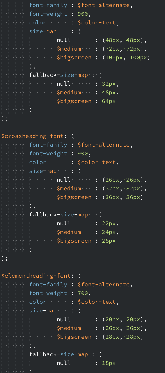
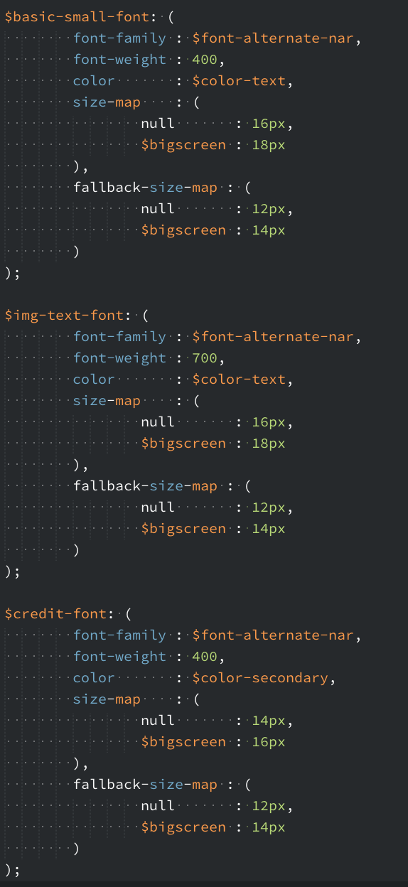
$kicker-font: (
  font-family  : $font-alternate-reg,
  font-weight  : 900,
  color        : $color-main,
  size-map     : (
     null      : (16px, 1.2),
     $medium   : 18px,
     $bigscreen: 20px
  ),
  fallback-size-map: (
     null      : (14px, 1.3),
     $medium   : 18px,
     $bigscreen: 20px
  )
);
.kicker {
  @include getFont($kicker-font);
}
.kicker {
  font-size: 0.875rem;
  line-height: 1.3; }

@media only all and (min-width: 37.5em) {
  .kicker {
    font-size: 1.125rem; }
}

@media only all and (min-width: 80.0625em) {
  .kicker {
    font-size: 1.25rem; }
}

.fonts-loaded .kicker {
  font-family: "Open Sans", Arial, Helvetica, Tahoma, sans-serif;
  font-weight: 900;
  font-size: 1rem;
  line-height: 1.2; }

@media only all and (min-width: 37.5em) {
  .fonts-loaded .kicker {
    font-size: 1.125rem; }
}

@media only all and (min-width: 80.0625em) {
  .fonts-loaded .kicker {
    font-size: 1.25rem; }
}
Debuggability:
Without properly configured source maps for SCSS, it may be harder to figure out how some styling ended up affecting a specific element (keeping in mind the above point about self-documentation no longer applies in the compiled CSS).
// sass --watch sass:css --style expanded --line-numbers

...
/* line 12, ../sass/style.scss */
.container {
  min-height: 100%;
  max-width: 1200px;
  width: auto;
  margin: 0 auto;
  padding: 0 20px;
}
/* line 19, ../sass/style.scss */
.container h1 {
  border-bottom: 2px solid black;
  color: #ff8700;
  margin: 0 0 0.5em;
}
Source Maps to work with original files in developer tools
scss --sourcemap sass/styles.scss public/styles.css
reference automatically included in CSS file:
/*# sourceMappingURL=styles.css.map */
Source Maps output
{
  "version": "3",
  "mappings": "4DAUA,qFAWQ,CACJ,OAAO,CAAE,KAAK,CAOlB,…",
  "sources": ["../sass/_vars.css”,”../sass/styles.scss"],
  "file": "styles.css"
}
Sass Source Maps helps debugging
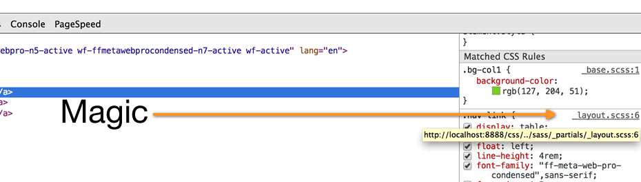
Source Maps connects the devtools with the original files
div.container {
  div.content {
    div.articles {
      & > div.post {
        div.title {
          h1 {
            a {
            }
          }
        }
        div.content {
          ul {
            li { ... }
          }
        }
      }
    }
  }
}
div.content div.container { ... }
div.content div.container div.articles { ... }
div.content div.container div.articles > div.post { ... }
div.content div.container div.articles > div.post div.title { ... }
div.content div.container div.articles > div.post div.title h1 { ... }
div.content div.container div.articles > div.post div.title h1 a { ... }
div.content div.container div.articles > div.post div.content { ... }
div.content div.container div.articles > div.post div.content ul { ... }
div.content div.container div.articles > div.post div.content ul li { ... }
be careful with extending
try to extend only single rules
.my-layout {
  margin: 1px;
  h1 {
    font-weight: bold;
    font-size: 2em;
  }
  h2 {
    @extend h1;
    font-size: 1.5em;
  }
}
.home-page { @extend .my-layout; }
.about-page { @extend .my-layout; }
.login-page { @extend .my-layout; }
.register-page { @extend .my-layout; }
.my-layout h1, .home-page h1, .about-page h1, .login-page
h1, .register-page h1, .my-layout h2, .home-page .my-layout
h2, .my-layout .home-page h2, .about-page .my-layout h2, .mylayout
.about-page h2, .login-page .my-layout h2, .mylayout
.login-page h2, .register-page .my-layout h2, .mylayout
.register-page h2, .my-layout .home-page h2, .homepage
.my-layout h2, .home-page h2, .about-page .home-page
h2, .home-page .about-page h2, .login-page .home-page h2, .homepage
.login-page h2, .register-page .home-page h2, .homepage
.register-page h2, .my-layout .about-page h2, .aboutpage
.my-layout h2, .home-page .about-page h2, .about-page .homepage
h2, .about-page h2, .login-page .about-page h2, .aboutpage
.login-page h2, .register-page .about-page h2, .aboutpage
.register-page h2, .my-layout .login-page h2, .loginpage
.my-layout h2, .home-page .login-page h2, .login-page .homepage
h2, .about-page .login-page h2, .login-page .about-page
h2, .login-page h2, .register-page .login-page h2, .loginpage
.register-page h2, .my-layout .register-page h2, .registerpage
.my-layout h2, .home-page .register-page h2, .registerpage
.home-page h2, .about-page .register-page h2, .registerpage
.about-page h2, .login-page .register-page h2, .registerpage
.login-page h2, .register-page h2 {
  font-weight: bold;
  font-size: 2em;
}
Sass should be kept as simple as it can be
Do not chain more than three simple selectors.
// good
.horse { ... }

// often useful
.horse + .horse { ... }

// suspicious
.horse > .donkey { ... }

// uh ...
.horse > .donkey + .mule { ... }

// call the police
ul li a span { ... }
@content coming before any declaration;@content coming after any nested selector;})..foo {
$length: 42em;
@include ellipsis;
@include size($length);
display: block;
overflow: hidden;
margin: 0 auto;
&:hover {
color: red;
}
@include respond-to('small') {
overflow: visible;
}
}
http://codeguide.co/ – Frontend Coding Guidelines
Linting code is very important.
Usually, following guidelines from a styleguide helps reducing the amount of code quality mistakes but nobody’s perfect and there are always things to improve.
So you could say that linting code is as important as commenting it.
https://github.com/sasstools/sass-lint
If you want to plug SCSS lint into your Grunt build process, you will be pleased to know there is a Grunt plugin for that called grunt-scss-lint.
Good tutorial: http://davidtheclark.com/scss-lint-styleguide/
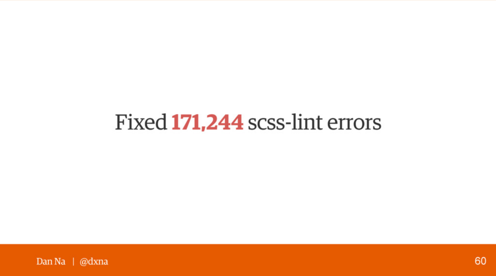
Guardian Success Story: https://www.theguardian.com/info/developer-blog/2014/may/13/improving-sass-code-quality-on-theguardiancom
'use strict';
module.exports = function(grunt) {
  grunt.config.set('scsslint', {
    all: [
      'src/scss/**/*.scss',
    ],
    options: {
      config: '.scss-lint.yml',
      reporterOutput: 'scss-lint-report.xml',
      colorizeOutput: true,
      compact: true,
      maxBuffer: NaN,
      exclude: [
        'src/scss/vendors/fancybox/**.scss',
        'src/scss/vendors/daterangepicker/**.scss',
        'src/scss/vendors/slickslider/**.scss',
        'src/scss/components/_form.scss'
      ]
    }
  });

  grunt.loadNpmTasks('grunt-scss-lint');

};If there is a feature that is often overlooked by Sass developers, it is the ability to dynamically output warnings and errors. Indeed, Sass comes with three custom directives to print content in the standard output system (CLI, compiling app…)
@debug / @warn / @error
/* example function with @warn */
@function line-height($target, $context: $base-fontsize){
  @if (unitless($target)) {
    @return $target;
  } @else if unit($target) == "px" {
    @return strip-units($target) / strip-units($context);
  } @else {
    @warn "Not a number value: #{$target}";
    @return $target;
  }
}
_shame.scss
Putting all the CSS declarations, hacks and things we are not proud of in a shame file. This file, dramatically titled _shame.scss, would be imported after any other file, at the very end of the stylesheet.
/**
 * Nav specificity fix.
 *
 * Someone used an ID in the header code (`#header a {}`)
 * which trumps the nav selectors (`.site-nav a {}`).
 * Use !important to override it until I
 * have time to refactor the header stuff.
 */
.site-nav a {
    color: #BADA55 !important;
}
Our goal should be to develop reusable components that can contain a range of content types. The most reusable components are those with class names independent of the content they hold.
modules/
  _color.scss
  _typography.scss
partials/
  _base.scss
  _navigation.scss
vendor/
  _ico-moon.scss
main.scss
  base/
      _reset.scss
      _typography.scss
      _color.scss
  components/
      _buttons.scss
      _navigation.scss
      _gallery.scss
  layout/
      _header.scss
      _grid.scss
      _sidebar.scss
  pages/
      _home.scss
      _about.scss
      _contact.scss
  themes/
      _theme.scss
      _admin.scss
  helpers/ (or utils/)
      _variables.scss
      _functions.scss
      _mixins.scss
  vendors/
      _bootstrap.scss
      _jquery-ui.scss
  main.scss
Module Vars
// Module Social Bar
$MODsocialbar: "socialbar";

$MODsocialbar__btnsize  : $button-size;
$MODsocialbar__colortext: $white;

$MODsocialbar__icons: (
  (facebook , #3b5998, '\E611'),
  (twitter  , #55acee, '\E612'),
  (gplus    , #dc4e41, '\E614'),
  (whatsapp , #43d854, '\E625'),
  (messenger, #0084ff, '\E903'),
  (youtube  , #d22322, '\E905'))
);

// BEM structure
.#{$MODsocialbar} {

  &__list {}
  &__item {}

  &--altdir {}
  &--fixed {}
}
Components/
├── Header/
|   ├── Header.js             // component code
|   ├── Header.scss           // component styles
|   ├── Header.spec.js        // component-specific unit tests
|   └── Header.fixtures.json  // any mock data the component tests needs
├── Button/
|   ├── Button.md             // usage documentation for the component
|   ├── Button.js             // ...and so on, you get the idea
|   └── Button.scss