CSS3
verkannte & neue Features
DWX, Nürnberg 25.06.2013
Sven Wolfermann | maddesigns
L O A D I N G
DWX, Nürnberg 25.06.2013
Sven Wolfermann | maddesigns
L O A D I N G

Twitter: @maddesigns
Web: http://maddesigns.de

neue Attribut-Selektoren
[title]
[href="foo"]
[href*="google"]
[href^="http"]
[href$=".jpg"]
[data-*="foo"]
[foo~="bar"]
Pseudo-Klassen
:link
:active
:hover
:visited
:checked

:first-child
:after
:before

:target
:not(selector)
::pseudoElement - style fragments of an element
:nth-child(n) - target nth child element.
:nth-last-child(n) - target nth child element but from the end
:last-child
Übergänge zwischen dynamischen Pseudoklassen steuern
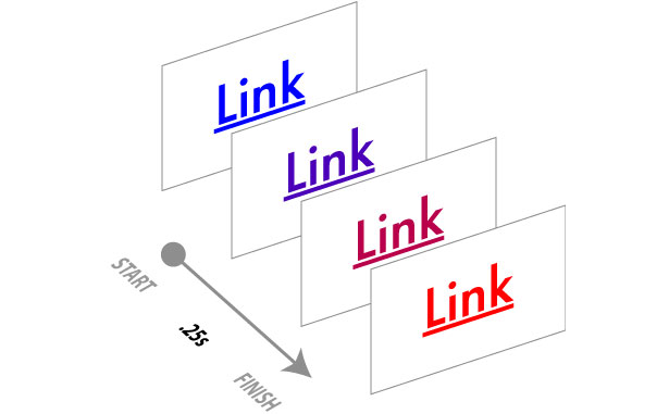
dynamische Pseudoklassen
:hover, :active, :focus, :target, :link, :visited, :disabled, ...
aber auch zwischen @media-Queries
mit Kurzschreibweise und allen benötigten Browser-Präfixen
.box {
  -webkit-transition: all 1s ease;
       -o-transition: all 1s ease;
          transition: all 1s ease;
}
.box:hover {
  background-color: #184070
}
ohne CSS3 mit CSS3 transition
a.transition1 {
  transition: color 1s ease-out;
  /* weitere Browser Varianten */
}
a.transition2 {
  transition: background-color 1s ease-out;
  /* weitere Browser Varianten */
}
a:hover {
  background-color: red;
  color: white;
}
transition-property
welche Eigenschaft wird verändert, z.B. background-color, opacity, … oder all – also alle Eigenschaften gleichzeitig
transition-duration
Die Dauer der Veränderung – Angabe einer Zeit für alle oder kommagetrennt je “transition-property” Eigenschaft
transition-timing-function
Bézierkurve á la jQuery Animation, also ob die Animation gleichmäßig abläuft linear oder ease-Kurven.
transition-delay
Eine Verzögerung der Veränderung, sozusagen bis die Animation beginnt
Ceaser - CSS Easing Animation Tool (matthewlein.com/ceaser/)
cubic-bezier.com (cubic-bezier.com)
CSS Transitions 101 (www.webdesignerdepot.com/2010/01/css-transitions-101/)
Let the Web move you — CSS3 Animations and Transitions (www.webdirections.org/blog/let-the-web-move-you-css3-animations-and-transitions/)
Chrome unprefixed seit v26 (aktuell v27)
Firefox unprefixed seit v16 (aktuell v21 / v21)
Opera / Mobile seit 12.1 / 12.1 (12.15 / 14)*
Safari / iOS unprefixed ab v7 / v7 (6.0 / 6.1)
Android mit -webkit-prefix seit Version 2.1 (4.2)
IE / mobile unprefixed seit v10 (10.0 / 10.0)
* Opera mit WebKit-Engine
jetzt kommt Bewegung ins Spiel!
@-webkit-keyframes pulse {
  from {
    -webkit-transform: scale(1);
  }
  to {
    -webkit-transform: scale(2);
  }
}
.animation {
  -webkit-animation: pulse 1s ease 0s alternate none infinite;
     -moz-animation: pulse 1s ease 0s alternate none infinite;
          animation: pulse 1s ease 0s alternate none infinite;
}
.animation:hover {
  -webkit-animation-play-state:paused;
     -moz-animation-play-state:paused;
          animation-play-state:paused;
}
Shorthand:
/* plus prefix */
animation: pulse 1s ease 0s alternate none infinite;
Einzeleigenschaften
animation-name: pulse
animation-duration: 1s
animation-timing-function: ease
animation-delay: 0s
animation-direction: alternate
animation-fill-mode: none
animation-iteration-count: infinite
HTML
<div class="bubble">
  <img src="https://upload.wikimedia.org/wikipedia/commons/thumb/4/44/BMW.svg/50px-BMW.svg.png" alt="" />
  <q>Lorem ipsum dolor sit amet, consectetur adipisicing elit. Dignissimos aut quod facere enim eos</q>
  <cite>BMW</cite>
</div>
.bubble {
  position: relative;
  width: 300px;
  height: 300px;
  margin: 1em auto;
  padding: 1.5em;
  text-align: center;
}
.bubble:before {
  content: '';
  background-color: #fff;
  position: absolute;
  top: 0;
  bottom: 0;
  left: 0;
  right: 0;
  z-index: -1;
  border-radius: 50% 50% 0 50%;
}
@keyframes bubble {
  0% {
    transform: rotate(40deg);
  }
  100% {
    transform: rotate(20deg);
  }
}

.bubble:before {
  animation-name: bubble;

  animation-duration: 3s;
  animation-iteration-count: infinite;
  animation-timing-function: ease-in-out;
  animation-fill-mode: both;
  animation-direction: alternate;
}
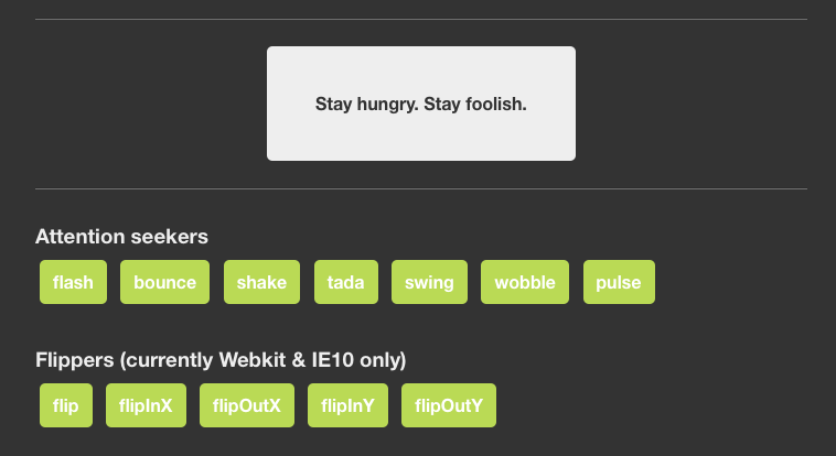
Animate.css (daneden.me/animate/)
Animatable (leaverou.github.com/animatable/)
Chrome prefixed seit v4 (aktuell v27)
Firefox unprefixed seit v16 (aktuell v21 / v21)
Opera / Mobile unprefixed seit 12.1 (12.15 / 14)*
Safari / iOS prefixed seit v4 / v3.2 (6.0 / 6.1)
Android prefixed seit Version 2.1 (buggy) (4.2)
IE / mobile unprefixed seit v10 (10.0 / 10.0)
* Opera mit WebKit-Engine und -webkit-prefix
Neuland
Elemente 3-dimensional transformieren
HTML
<section class="container">
  <div class="card">
    <figure class="card__front">front</figure>
    <figure class="card__back">back</figure>
  </div>
</section>
CSS
.container {
  width: 200px;
  height: 260px;

  position: relative;
  margin: 3em auto;
  border: 1px solid #CCC;

  perspective: 800px;
}
.card {
  width: 100%;
  height: 100%;
  position: absolute;
  transition: transform 1s;
  transform-style: preserve-3d;
}
.container:hover .card {
  transform: rotateY(180deg);
}
.card figure {
  height: 100%;
  width: 100%;
  line-height: 260px;
  color: white;
  text-align: center;
  font-weight: bold;
  font-size: 36px;
  position: absolute;
  backface-visibility: hidden;
}
.card__front {
  background: red;
}
.card__back {
  background: blue;
  transform: rotateY(180deg);
}
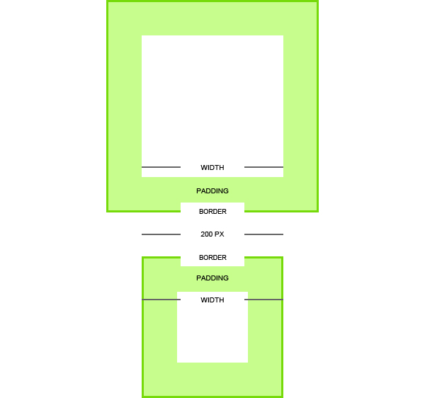
element {
  width: 80%;
  padding: 0 2.5%;
  border: 1px solid #333;
}
Breite des Elements?
* {
  -webkit-box-sizing: border-box; /* Android 2.1-3.0 */
  -moz-box-sizing: border-box;
  box-sizing: border-box;
}
Die Breite der Element beinhaltet die Inhaltsbreite inklusive Padding & Border.
.content {
  height: calc(100% - 3em;)
}
.footer {
  height: 3em;
}
.bgposcalc {
  background-image: url(http://placekitten.com/g/300/200);
  background-repeat: no-repeat;
  background-position: calc(100% - 30px) calc(100% - 10px);
}
Chrome unprefixed seit v26 (aktuell v27)
Firefox unprefixed seit v16 (aktuell v21 / v21)
Opera / Mobile nächte Version (-- / 14)*
Safari / iOS prefixed seit v6.0 / v6.0 (6.0 / 6.1)
Android nope :(
IE / mobile unprefixed seit v9 (10.0 / 10.0)
* Opera mit WebKit-Engine und -webkit-prefix
<h1>Überschrift
  <span>mit Subline </span>
</h1>
body {
  font-size: 16px; }
h1 {
  font-size: 1.5em; /* 24px / 16px */
  line-height: 1; }
span {
  font-size: 1em; /* 16px / 16px */
  display: block; }
Bei der Berechnung von em-basierenden Schriften acht geben. Der em-Wert bezieht sich auf das Elternelement
span {
  font-size: 0.666666667em; /* 16px / 24px */
}
In fast allen Browsern ist 16px die Default-Schriftgröße, nur einige Mobile-Browser haben höhere Schriftgrößen. Blackberry OS 6.0 = 22px, Kindle Touch = 26px.
rem Schriftgrößen basieren auf das Rootelement (<html>)
html {
  font-size: 16px;
}
span {
  font-size: 1rem; /* 16px / 16px */
}
span {
  font-size: 2rem; /* 32px / 16px */
}
SCSS Pixel-Fallback für OldIE
$main-font-size: 16px;

@mixin x-rem ($property, $value) {
  #{$property}: $value * $main-font-size;
  #{$property}: #{$value}rem;
}

.some-class {
  @include x-rem(font-size, 1.4);
}
.some-class {
  font-size: 22.4px;
  font-size: 1.4rem;
}
Chrome seit v6 (aktuell v27)
Firefox seit v3.6 (aktuell v21 / v21)
Opera / Mobile seit v11.6/v12 (12.1 / 14)
Safari / iOS seit v5.0 / v4.0 (6.0 / 6.1)
Android seit v2.1 (4.2)
IE / mobile seit v9 (10.0 / 10.0)
Textlängen beschneiden
.class {
  overflow: hidden;
  text-overflow: ellipsis;
  white-space: nowrap;
}
Demo: Lorem ipsum dolor sit amet, consectetur adipisicing elit. Ab eaque dignissimos eveniet aliquid perferendis pariatur dolorum fugit earum nisi id repellendus tenetur odit alias laudantium minima deleniti beatae sed rem.
"Problem": geht nur bei einzeiligen Texten (white-space: nowrap)
h3 {
font-size: 16px;
line-height: 1.4;
max-height: 46px;
overflow: hidden;
width: 180px;
}
.shy {
/* use the HTML-entity */
}
.hyphens {
-webkit-hyphens: auto;
   -moz-hyphens: auto;
        hyphens: auto;
}
.word-break {
/* Non standard for webkit */
word-break: break-word;
-ms-word-break: break-all;
word-break: break-all;
}
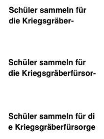
-webkit-hyphens: auto;
-moz-hyphens: auto;
hyphens: auto;
}
hyphenate-limit-lines: 2;
hyphenate-limit-chars: 6 3 2;/* longer than 6 characters, 3 or more
                                before break, 2 or more after break */
HSL ist ein weiterer Farbraum – Hue, Saturation, Luminance (Farbton, Sättigung, Helligkeit)
hsl(210,80%,70%) darken 10% -› hsl(210,80%,60%)
rgb(117,178,240) darken 10% -› Open Photoshop!
transparente Hintergrundfarbe
/* RGBA */
element {
  background: rgba(255, 0, 255, 0.5);
}
/* HSLA */
element {
  background: hsla(300, 100%, 50%, 0.5);
}
div {
    position: relative;
    z-index: 1;
}

.opacity-bg:before {
    background: black url("http://placekitten.com/g/400/300") no-repeat;
    background-size: cover;
    opacity: 0.5;
    content: "";
    position: absolute;
    top: 0;
    bottom: 0;
    left: 0;
    right: 0;
    z-index: -1;
}
HTML
<div class="lightbox">
  Lightbox
</div>
CSS
.lightbox {
  background: white;
  background-clip: padding-box;
  text-align: center;
  margin: 8em -15em;
  padding: 5em 1em;
  width: 30em;
  position: absolute;
  left: 50%;
  border: 1em solid rgba(0,0,0,0.7);
  border-radius: 1em;

  box-shadow: 0 0 0 9999px rgba(0,0,0,0.5);
}
Sven Wolfermann | maddesigns
Twitter: @maddesigns